Sales Dashboards: Eight Examples, and the Board Your Reps Work From
The sales dashboards that rank today are built to be read.
We counted 27 published examples and found 3 that reach individual deals and none built from a team's written process. Here are eight dashboards worth building, each paired with the list of records that acts on it.
Sales dashboards are single screens that show a sales team's most important numbers, such as revenue against target, pipeline by stage and rep activity, so leaders can monitor performance at a glance.
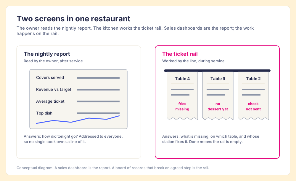
A restaurant runs on two screens. After service, the owner reads a report: covers served, revenue against target, the average ticket, the dish that sold best. During service, the kitchen works a rail of paper tickets, one per table, each one saying what that table still needs. No cook works from the nightly report. The report tells the owner how the night went; the rail is how the night goes.
Sales dashboards are single screens that show a sales team’s most important numbers, such as revenue against target, pipeline by stage and rep activity, so leaders can monitor performance at a glance. They are the nightly report. That is a fine and useful job, and most of this post is about doing it well: eight sales dashboard examples worth building, the questions each answers, and who should read them. But the pages that rank for this search stop at the report. We counted 27 published examples on the top three results and found 3 that reach individual deals and none built from the team’s written process. The rail is missing, and the rail is where reps change the number.
What is a sales dashboard for?
The man who wrote the definition most dashboard vendors still paraphrase was Stephen Few, a data visualization consultant, in a 2004 article called “Dashboard Confusion.” He wrote that “a dashboard is a visual display of the most important information needed to achieve one or more objectives; consolidated and arranged on a single screen so the information can be monitored at a glance.” Two years later he went further: “The most important defining characteristic of a dashboard, when compared to other means of presenting information, is that it is used for monitoring” (Few, Rich Data, Poor Data, 2006).
Monitoring is half of a job. The other half is doing something about what you see, and it usually falls to someone other than the person monitoring. A sales leader monitors pipeline; a rep adds the missing amount to a deal. The dashboard serves the first person well and the second person hardly at all.
The current top results agree with Few on purpose and then hope for more. Geckoboard, ranked first organically as of October 2, 2026, defines a sales dashboard as “a single screen showing your team’s most important sales metrics, updated automatically from your CRM,” and adds that “when teams have direct access to their own performance, they start to self-correct” (Geckoboard, reviewed July 2026). Tableau says dashboards “present relevant and actionable sales data” (Tableau). Self-correction does happen. The research below says when, and most dashboards are built in a way that prevents it.
What do the top sales dashboard examples show?
We read the three highest organic results for “sales dashboards” in Google US on October 2, 2026: Geckoboard (10 examples), Tableau (7) and Highspot’s list of 10 must-have dashboards, updated September 28, 2026 (Highspot). We then sorted all 27 examples by what each one puts in front of the reader.
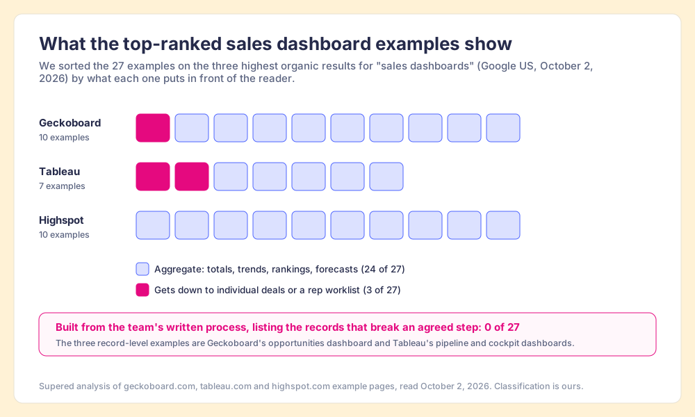
- Aggregates, 24 of 27. Totals, trends, rankings and forecasts: revenue against quota, pipeline by stage, leaderboards, average deal size, recurring revenue.
- Record-level views, 3 of 27. Geckoboard’s opportunities dashboard (“which deals are live, what they are worth, and which ones need a next step,” useful “when a stage-level view is too aggregated to act on”) and Tableau’s pipeline and cockpit dashboards.
- Built from the written process, 0 of 27. None starts from the steps the team agreed to and lists the records that break one.
Geckoboard’s own line about the opportunities dashboard says it best: the stage view was “too aggregated to act on.” That sentence describes the other 24 as well.
Why do most sales dashboards get read but not worked?
Psychologists have studied this for a century under a plain name: social loafing, the tendency to put in less effort on a shared task than on a solo one. Steven Karau and Kipling Williams pooled 78 studies in 1993 and found the effect held across tasks and populations, from rope-pulling to rating poems. They also found what makes it disappear. Effort held up when “evaluation potential” was present, and evaluation needed two conditions: “(a) the participant’s output must be known or identifiable, and (b) there must be a standard (personal, social, or objective) with which this output can be compared” (Karau and Williams, Journal of Personality and Social Psychology, 1993). Without both, people “hide in the crowd.”
Now run a sales dashboard through those two tests.
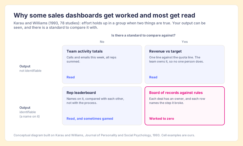
A team activity total fails both tests. One rep’s calls disappear into the sum, and there is no line it should reach. Revenue against target has a standard, the quota line, but the whole team owns the line, so no one person does. A rep leaderboard puts names on the screen, which passes the first test, but the comparison is with other reps, so the rep at the bottom learns where they rank and nothing about which step they skipped.
The fourth cell has both. A list of open deals, each with an owner’s name, each row stating the step it broke (“past Discovery with no amount”), passes the identifiability test and carries its own standard. It is the kitchen ticket with a table number on it. The kitchen comparison stops at one point. A cook also works fast because a diner is waiting, and a rep’s buyer is waiting too, so part of the effect is the deadline. The two conditions still decide whether the rep can see that the buyer is waiting.
Gartner found the cost of the first three cells at scale. In a survey of 303 sales leaders in July 2023, 84% agreed that sales analytics had less influence on sales performance than they expected. Kelly Fischbein, a senior principal in Gartner’s sales practice, said that “many organizations struggle to produce actionable insights regarding their most important decisions” (Gartner, February 2024). More charts will not fix that. A second screen, built to be worked, will.
Which sales dashboards should you build? Eight examples
These are the eight sales dashboard examples we recommend for a mid-market team. Each answers one question for one reader at one cadence. Each also has a twin: the list of records behind the number that break a step, which the owner of each record can clear. Build the dashboard for the leader and the twin for the rep.
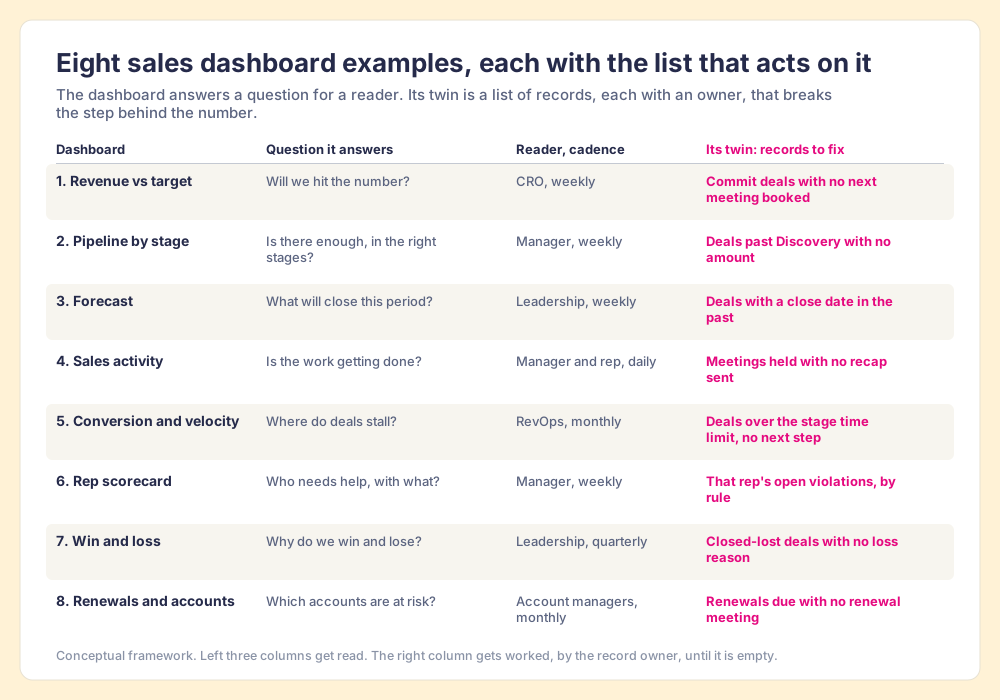
- Revenue against target. It answers the CRO’s weekly question, will we hit the number? A cumulative line against the quota line, read weekly. Its twin is the list of commit deals with no next meeting on the calendar, because the forecast is guessing about any deal with no meeting booked.
- Pipeline by stage. It tells the manager whether there is enough pipeline in the right stages. Value and count by stage, read weekly. Its twin is the list of deals past Discovery with no amount, which make the stage totals wrong before anyone reads them.
- Forecast. Commit, best case and pipeline for the period, read weekly by leadership. Its twin is the deals with a close date in the past, the commonest reason a forecast slides without anyone deciding it should.
- Sales activity. Calls, emails, meetings and demos by rep, read daily by reps and weekly by managers. Its twin is the meetings held with no recap sent. (More on this one below.)
- Conversion and velocity. Stage-to-stage conversion and days in stage, read monthly by RevOps. Its twin is the deals past the time limit you set for a stage with no next step booked.
- Rep scorecard. One page per rep, read weekly in the one-on-one. Its twin is that rep’s open violations by rule, which turns the one-on-one from “your numbers are down” into three named deals and the step each one is missing.
- Win and loss. Win rate and loss reasons by segment, read quarterly. Its twin is the closed-lost deals with no loss reason, without which the win-loss chart is drawn from the deals people remembered to explain.
- Renewals and accounts. Renewal dates, account health and expansion, read monthly by account managers. Its twin is the renewals coming due with no renewal meeting booked.
The twins share one shape, a condition plus the records it applies to plus an owner. They are rules. Our post on how to track sales progress walks through writing them; sales KPIs has the formulas for the numbers on the left.
What goes in a sales activity report?
A sales activity report counts the actions reps took in a period, such as calls made, emails sent, meetings held, demos given, proposals out, usually by rep and by week. Tracking seller activity is good and necessary. It is how a manager sees that the work is being done at all, and a rep who held no discovery calls this month will not have a pipeline next month.
The report gets more useful when each count sits beside the step it should produce:
- Meetings held, beside recaps sent. The gap is the number of buyers who left a call without a written next step.
- Discovery calls, beside deals with an amount. The gap is the discovery that has not yet reached the CRM.
- Demos given, beside named decision makers. The gap is how many demos went to someone who cannot sign.
Each gap is a list of records with an owner, which makes the activity report the one dashboard that comes closest to the rail on its own. A stage should also reflect where the buyer is, so the pairs show both: what the rep did and whether the buyer moved. Our post on sales activity metrics covers which counts to keep.
How do you build a sales dashboard that changes behavior?
The build is short once you know which screen is for whom.
- One question per view. Write the question at the top of the view (“Will we hit the number?”). A view that answers no question gets cut.
- A standard beside every number. In the same 2006 paper Few advises choosing “the one best comparison” for each measure, “two comparisons at most.” Without a target or prior period, a number cannot be judged, and Karau and Williams would say it cannot be worked either.
- A named reader and cadence. The CRO weekly, the manager weekly, RevOps monthly. A dashboard addressed to the whole company gets read by the person who built it.
- A link from each aggregate to its twin. The pipeline chart opens to the deals that break a pipeline rule, each with its owner.
- The twin delivered where the rep works. A list that lives in a separate tool gets opened on the day of the pipeline review and on no other day.
The last item matters most, and our own research shows why. In The State of Sales Enablement 2026, 89% of teams had a defined process and 36% saw reps run it. Teams that inspect deals against a defined process at the highest frequency hit quota at 6.3x the rate of the lowest band. And the inspection runs out with manager hours: process adherence was 47% on teams with one to five reps per manager and 23% at six to eight. A manager with eight reps cannot read eight reps’ records every night. Software can, and then the manager’s hours go to coaching the deals it found.
Which sales analytics tools do you need?
Sales analytics tools sort into layers by the question they answer. A team of ten reps can run on the first layer; the middle layers earn their cost as questions cross systems; and reps work from the last one alone.
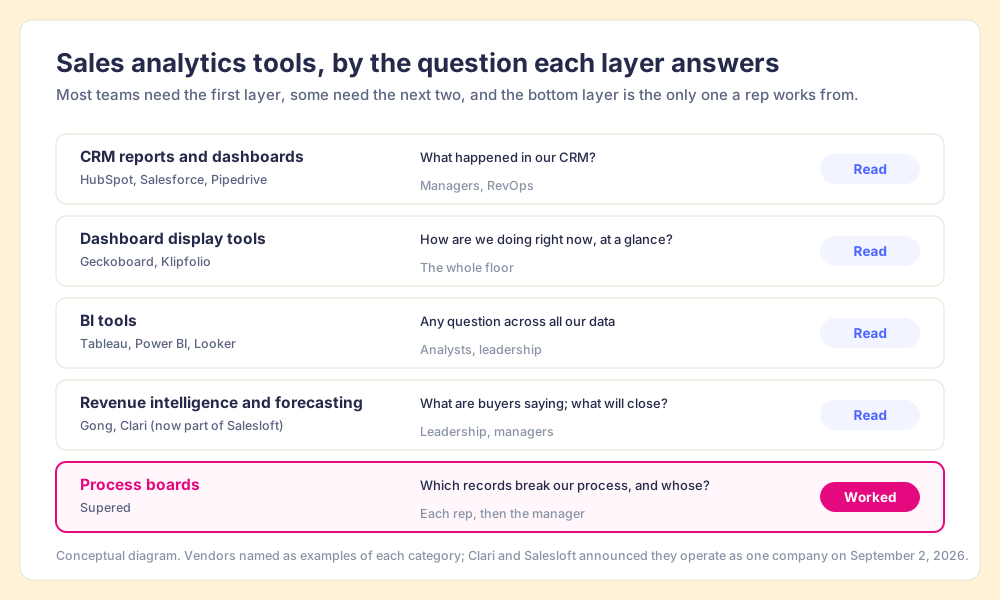
| Layer | Example tools | Question it answers | Who uses it | Read or worked |
|---|---|---|---|---|
| CRM reports and dashboards | HubSpot, Salesforce, Pipedrive | What happened in our CRM? | Managers, RevOps | Read |
| Dashboard display tools | Geckoboard, Klipfolio | How are we doing right now, at a glance? | The whole floor | Read |
| BI tools | Tableau, Power BI, Looker | Any question across all our data | Analysts, leadership | Read |
| Revenue intelligence and forecasting | Gong, Clari (part of Salesloft) | What are buyers saying; what will close? | Leadership, managers | Read |
| Process boards | Supered | Which records break our process, and whose are they? | Each rep, then the manager | Worked |
- CRM reports first. The data already lives there, the reports cost nothing extra, and they answer most of the eight questions above. Start here before buying anything.
- A display tool for the wall. Worth it when the team sits together and you want the number visible all day; it adds no new data.
- BI when the questions cross systems. Billing, product usage and CRM in one view needs a warehouse and someone to run it.
- Revenue intelligence for the forecast call. Clari and Salesloft announced on September 2, 2026 that they now operate as one company, with Clari Forecast keeping its name (GlobeNewswire).
- A process board for the rail. The only layer whose output is a list of records, each with an owner and a broken step.
What we recommend
Teams run sales dashboards in one of three ways.
- Dashboards alone. Leaders monitor well and act through meetings. The number is visible; the cause surfaces a week later.
- Dashboards plus manual inspection. Managers open records before the pipeline review. It works up to about five reps per manager, which is where our survey shows adherence starting to fall.
- Dashboards for leaders, a board of records for reps. The approach we recommend.
Choose the third. Build the eight dashboards above for the people who monitor. Then write the step behind each number as a rule, check the rules against every open record every night, and hand each rep the list of their own records that break one. The case rests on three findings in this post. Few’s definition says dashboards are for monitoring, Karau and Williams show effort follows identifiable output measured against a standard, and teams that inspect deals against a defined process at the highest frequency hit quota at 6.3x the rate of the lowest band.
In Supered, the rules live as Process Rules inside a Process Ruleset, and a Process Board lists every record that breaks one, with its owner, in HubSpot, Salesforce or Pipedrive. Reps clear their own lists where they already work, in the CRM or in Claude, and managers see which rules fire most and on whom. Process Compliance is $40 per user per month paid yearly, with a 5-user minimum (pricing). The sales expectations use case shows a board from rules to morning summary.
If your team discusses the dashboard in a weekly meeting, read pipeline review next: it covers how to run the meeting from the list of broken steps instead of from the chart. For why reps drift from a process in the first place, sales process adoption has the evidence. Or book a demo and bring the one dashboard your team only reads; we will show you its twin.
Frequently asked questions
What is a sales dashboard?+
What should be on a sales dashboard?+
What are good sales dashboard examples?+
What is a sales activity report?+
What are the best sales analytics tools?+
Why do sales dashboards fail to change performance?+
Your process, running itself.