What 53 G2 Badges Told Us About Our Own Category Problem
Our customers filed us in eight different G2 categories. That spread is the most honest market research we have, and the research says spanning categories carries a real cost. Here is how to read your own.
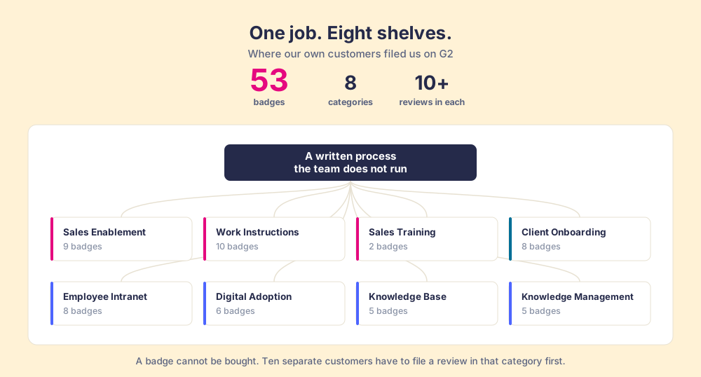
A G2 badge is a per-category award issued each quarter from verified customer reviews, which a product can only hold in a category where at least 10 real customers reviewed it; a vendor's badge spread is therefore a record of what buyers think the product is for.
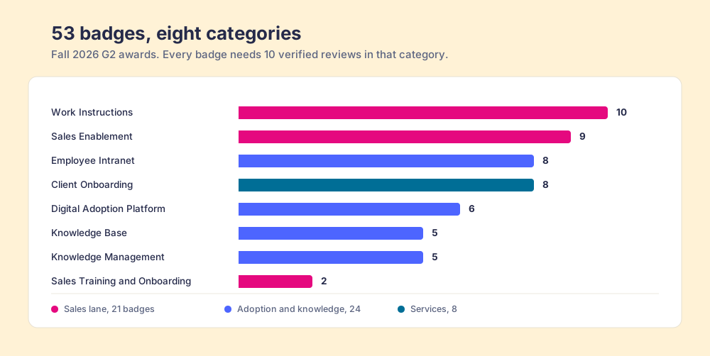
We have 53 G2 badges. The interesting thing is not the number. It is that they landed in eight different categories, and only three of them are the category we tell people we are in.
Sales Enablement, Sales Training and Onboarding, Work Instructions, Digital Adoption Platform, Employee Intranet, Knowledge Base, Knowledge Management, Client Onboarding. Twenty-one badges in the sales lane. Twenty-four in the adoption and knowledge lane. Eight in client onboarding. A product that describes itself one way, filed by its own customers eight ways.
The first instinct in that situation is to treat the spread as a branding failure and go tidy it up. That instinct is wrong, and the reason it is wrong is worth more than the badges.
What does a G2 badge certify?
A badge is not a prize a vendor buys. It is a per-category award computed from verified reviews, and the gate is specific: a product needs at least 10 reviews in that category before it appears on the Grid at all, and the category itself needs at least six products carrying 10+ reviews plus 150 reviews overall (G2 scoring methodology). Placement then comes off two axes, Satisfaction and Market Presence.
The full picture has two halves, and skipping either one gets you a wrong answer:
- Vendors propose the categories. G2 approves or declines the request, so the list of g2 categories a product appears in is not purely customer-generated. Any vendor can ask to be listed anywhere plausible.
- Only customers can fill them. Ten separate people have to file a review in that specific category before a badge exists. There is no way to buy past that gate.
So the proposal is ours and the badge is theirs. That second half is what makes the spread worth reading. Eight categories means that in eight different places, ten or more people independently decided this was the shelf the product belonged on.
The Dewey problem
A library files a book about the psychology of chess under psychology, or games, or mathematics. One book, three defensible shelves, and the shelf is chosen by a cataloguer rather than by the author. The book does not change. Its findability changes enormously, because a person browsing shelves will only find it if they already guessed which shelf to browse.
Software categories work the same way, with one difference that makes it worse. In a library, the catalogue is at least trying to describe the book. In software, the category map was drawn for vendors, so that similar sellers could be compared side by side. Buyers then use that map to find their way through a problem that does not sit inside any one shelf.
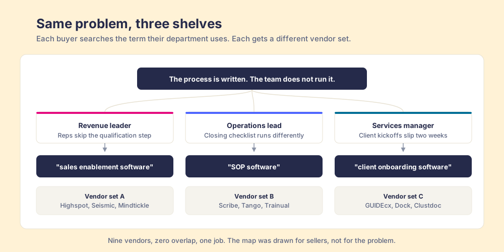
Here is what that looks like from the buyer’s side. A revenue leader whose reps skip the qualification step, an operations lead whose team runs the closing checklist differently every time, and a services manager whose client kickoffs slip by two weeks all have the same underlying problem: the process is written down and the team does not run it. Those three people will search “sales enablement software,” “SOP software,” and “client onboarding software.” Three shelves. Three completely different vendor sets. One job.
This is the same failure we describe in the execution gap: the process exists and the running of it does not. In our own survey of 198 sales leaders, 89 percent had a defined sales process and 36 percent saw it followed as designed, a 53-point gap (The State of Sales Enablement 2026). That gap does not care what department you sit in. The category map does.
What does spanning categories cost?
The comfortable read on a wide badge spread is that it proves versatility. The research says otherwise, and it is old enough and replicated enough to take seriously.
Ezra Zuckerman’s study of securities analysts found what he called an illegitimacy discount: firms that did not fit cleanly into the categories analysts covered were valued lower, not because of their fundamentals but because the people whose job was to evaluate them had no natural slot to evaluate them in (Zuckerman, 1999, American Journal of Sociology). Being hard to file is itself a cost.
Greta Hsu, Michael Hannan and Özgecan Koçak then tested category spanning in two markets that share almost nothing, eBay auctions and US feature films, and found the penalty in both. Products spanning multiple categories were evaluated less favorably than specialists, driven by two mechanisms working together: audiences struggle to classify a spanning product, and the producer cannot target each category’s audience properly (Hsu, Hannan & Koçak, 2009, American Sociological Review).
Both mechanisms are live for us. The audience-side one shows up in sales calls where a buyer has already decided what shelf we are on before the call starts. The producer-side one shows up in our own marketing, where eight categories means eight sets of competitors, eight comparison pages, eight sets of objections, and a finite team.
So the spread is real data and it is expensive. Those are both true, and holding them at the same time is the actual skill.
Why did category legibility get harder?
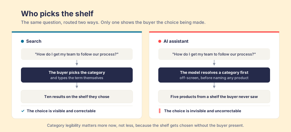
When a buyer used a search engine, they picked the shelf themselves and lived with it. When a buyer asks a model, the model picks the shelf first and then populates it, and the buyer never sees the choice being made.
Ask an assistant “what should we use to get our sales team to follow our process” and it resolves that into a category before it names a single product. Whatever category it lands on determines the entire answer. We can see this happening to us: models retrieve Supered in the digital adoption lane, next to Appcues and Pendo, which is a lane we decided in June was not the one we wanted to fight in.
This inverts the usual advice. The common line is that AI makes categories less important because a model can understand nuance. The opposite is happening. Software category positioning matters more now, because the shelf gets chosen without the buyer present to correct it.
How do you read your own category spread?
The move is not to fight the spread and not to chase it. It is to read it, then concentrate where two things overlap: a category where customers already validated you, and a category whose search results a company your size can enter.
That second test is the one that gets skipped, and skipping it is expensive. Keyword difficulty scores are built largely on how many links the ranking pages have, which makes them read low on results held by brand authority rather than by links. We pulled the actual results for every category we hold badges in. Three were reachable and three were traps.
- Reachable: “SOP software.” 800 US searches a month, and the entire top ten is built on almost nothing. The pages ranking there hold between zero and 28 referring domains, and the number ten result belongs to a domain rated 26. A well-made page wins that.
- Reachable: “client onboarding software.” 700 searches at roughly $16 a click, with the pages holding positions three and four sitting at domain ratings of 58 and 52. That is within reach.
- Trap: “employee intranet.” It looks like the best opportunity on the board. 800 searches, moderate difficulty, and a $40 cost per click that suggests serious commercial intent. The results are Wake Health, CommonSpirit Health, University of Illinois Hospital, Banner Health and Sedgwick County. Every one of those searchers is trying to log into their own employer’s portal. The $40 click price is intranet vendors bidding against each other for people who will never buy anything. It is a billboard on a road where every driver is already parked in their own driveway.
- Trap: “knowledge management system.” Volume of 3,100, difficulty scored 17, and a top ten of Gartner, IBM, Salesforce and Slack, with the leading pages carrying 148 and 188 referring domains. Nothing about that result set is winnable by link building, because it is not being won by links.
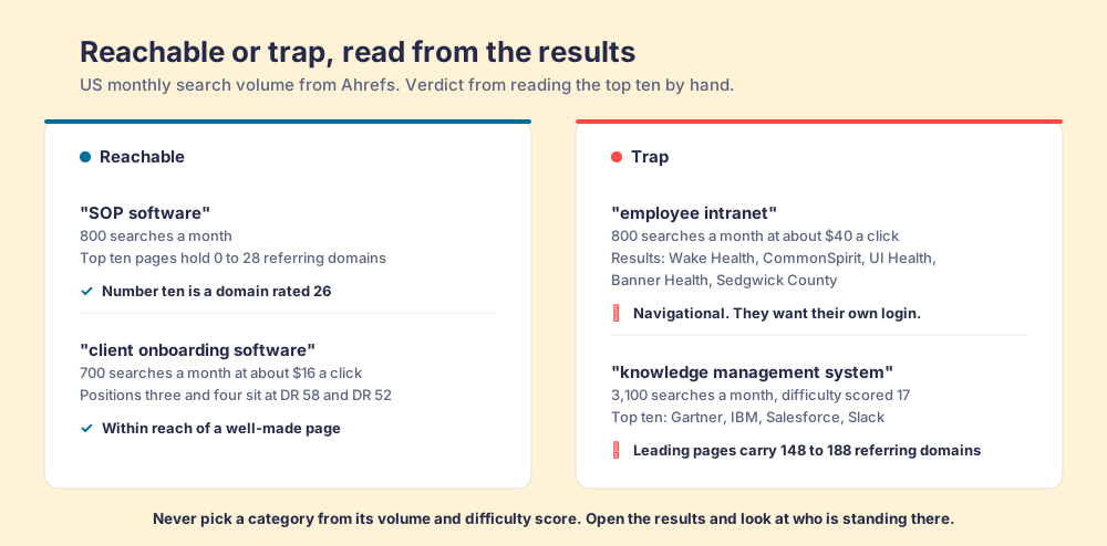
The rule that falls out of this: never pick a category from its volume and difficulty score. Open the results and look at who is standing there and what is holding them up. A term with 800 searches and no page-level authority in the top ten is worth more than a term with 3,100 searches held by IBM.
What we are doing with ours
We are keeping the badge wall whole. Hiding the adoption and knowledge badges to look more focused would be trimming the evidence to fit the story, and the evidence is the more valuable half. Every badge stays visible on our reviews page, categories included.
Then we are concentrating. Of the eight categories, we are writing into the two where customer validation and reachable results overlap, and treating the rest as proof rather than as territory. The badges in Employee Intranet still do a job. That job is credibility on the page, not a content programme.
The deeper point is the one the Hsu study makes and most positioning advice skips over. Being hard to categorize is not a communication problem you can write your way out of. It is a structural cost you either pay deliberately, in a category you chose, or pay accidentally, in eight you did not.
Our customers already voted. They filed us under the places where a written process was not being run: the sales floor, the operations manual, the client kickoff. Three shelves, one job, and the job is the thing we sell. The map was always going to be worse than the territory. Ours just happens to come with receipts.
You can see the full award list, category by category, on our reviews page, and the argument behind the product on what the behavior layer is.
Frequently asked questions
What are G2 badges and how are they earned?+
Can a vendor choose its own G2 categories?+
Is it bad for a product to hold badges in many categories?+
How should you use your G2 category spread to pick content topics?+
Your process, running itself.